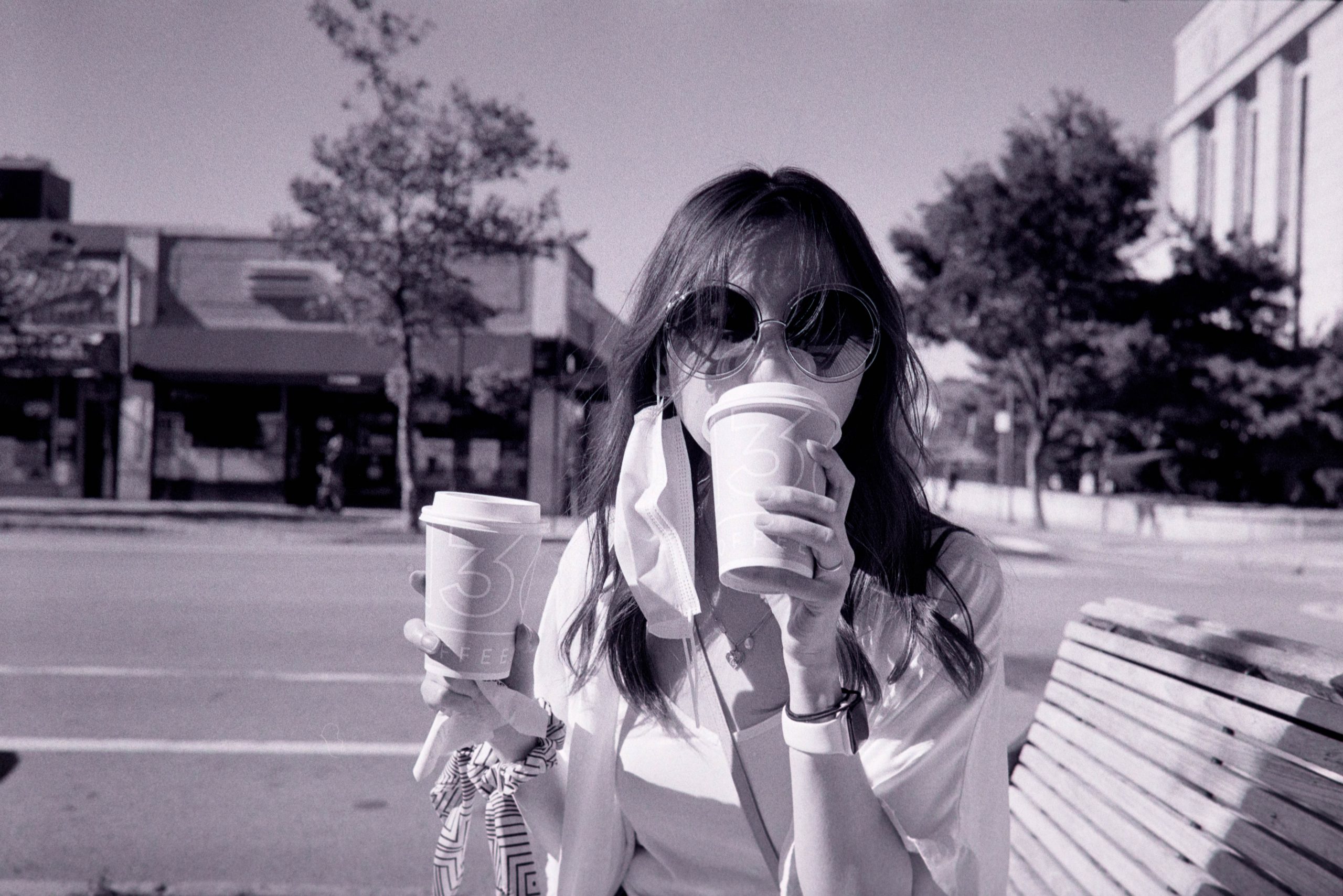
I finally got my hands on a roll of black and white film. I did have any idea about black and white films, so I chose a 400 roll just to make sure I’ll be able to use it in more situations compared to a 100. ILFORD’s name seems to be everywhere when you look at black and white films, so there we go.
I used a one step room temperature development process (Cinestill DF96) that contains developer and fixer. It was quite a simple process, which made me wonder if I should’ve started film photography with black and white. Despite the quick thought, I am sure I would’ve start on color film even if I knew how simple it was to do black and white. I simply like the film color tone that people are crazy at simulating using software.
As for scanning, I went for the DSLR scanning, which I’ll write about one day.
The result is quite interesting. I think black and white can do more of those abstract style, confusing looking photos that can be considered artistic. I think the reason for this is that the lack of color information separates the vision from the reality just enough to be baffling at first glance, while the brain is working quickly connecting the contrast, line and shape information to familiar concept. The key here is “slightly off reality”.
On the other hand, refusing color information, help simplifies composition. I heard a lot people talking about photography is about subtraction and simplicity, but I believe it’s really because human brains suck at consuming too much information. It is not that complex scene lacks beautify, but it’s certainly harder to compose. I believe this is the reason for the subtraction and simplicity argument. As for myself, I am also not good at arrangement, so losing color information do help better composition to be more story telling – I only work with line, shape, contract and depth of field, meaning I no longer need to worry about color harmony.
A interesting note to my post process: I did not convert the scanning to true black and white – they’re still cover images but very low in saturation. I find it more appealing to view.


Leave a Reply